What is a brand and how do I shape it?
1 min read

So, you’ve got a business – congratulations! We have to ask though – how much love are you giving to building your brand? Contrary to popular belief, ‘brand’ is not a synonym of ‘business’ and as marketeers it hurts us to think of the amount of businesses skipping past the brand-building stage of business development. If you’re wondering ‘what is a brand and how do I shape it?’ you’ve come to the right place.
Your brand is the soul of your business – it’s what defines who you are and what your business stands for. It’s what your target customers think of when they think of your company and the good news is that you can influence how they perceive you through careful brand building. You sell washing machines? Great! Or perhaps you teach people to manage their finances? Fab! But, do you know how to shape a brand to speak to its ideal customer? What are the characteristics of your brand that make your washing machines or coaching services so recognisable that they stand out amongst the rest?
We’re going to be sharing six key pillars that will help guide you through the process of shaping your brand personality. These steps are universal to what makes a brand out of a business and will hopefully provide you with some food for thought.

Tone of voice
Words are what you’ll use to communicate with your customers, so it’s important that the tone is right and you’re not turning your ideal audience off. The language you use in your business marketing is the voice that customers will learn to associate with your brand.
Is the language formal and professional? Or, Is it fun and humorous? It’s important to shape your tone of voice around who your ideal customers are.
Brand colours
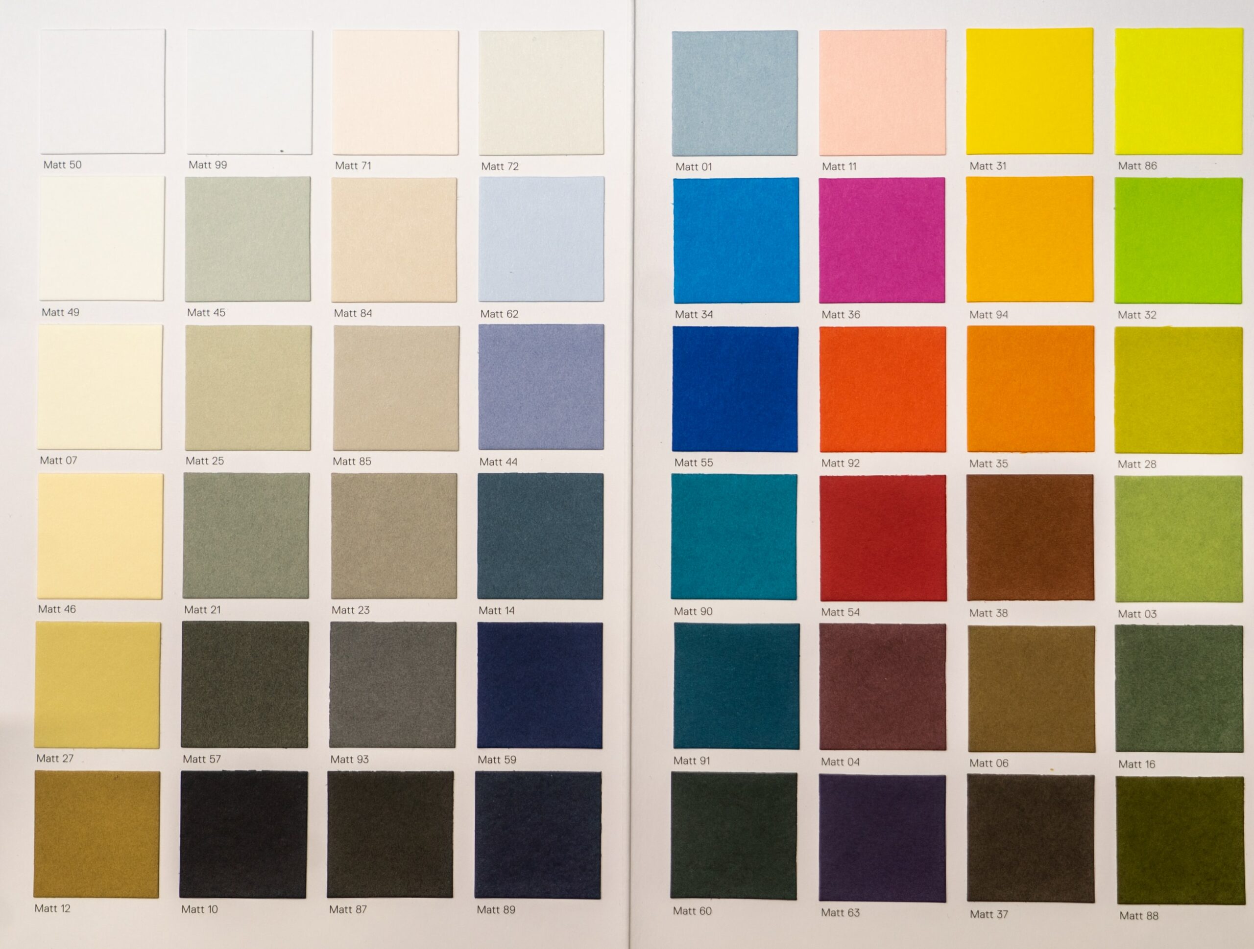
It’s recommended that you choose between three and five brand colours, to be used across each of your marketing platforms, including your website and in social content, as well as in your logo. Any less and you’ll be too limited, any more and you risk diluting your brand identity.
Imagery/videography
The imagery you choose will showcase your brand’s personality and character. It can also be practical, in the sense that video content on social media often increases engagement.
Will your imagery or video content showcase diversity? Is there anything you want to avoid? Will you use people in your imagery? If, so do you need to set up a photoshoot?
Brand logo
The simpler the better. A brand logo is the cornerstone of your brand and is usually the most recognisable part of your business. When you think of ‘Apple’ you think of the Apple logo, when you think of Disney, it’s easy to visualise the swirly typography of the Disney logo.

Placement
Where are you happy for your brand to be seen? If you’re targeting the luxury market, you probably don’t want your digital ad to appear on bargains.com. Likewise, if your key audience is young mums, there’s little point advertising in the Gentleman’s journal.
Sound
This won’t be applicable to every brand, but some do build sound into their brand identity. Some brands have even developed a sound logo, which is as synonymous with the brand as it’s actual, visual logo. Think McDonalds and ‘I’m lovin’ it.’
Branding done really well
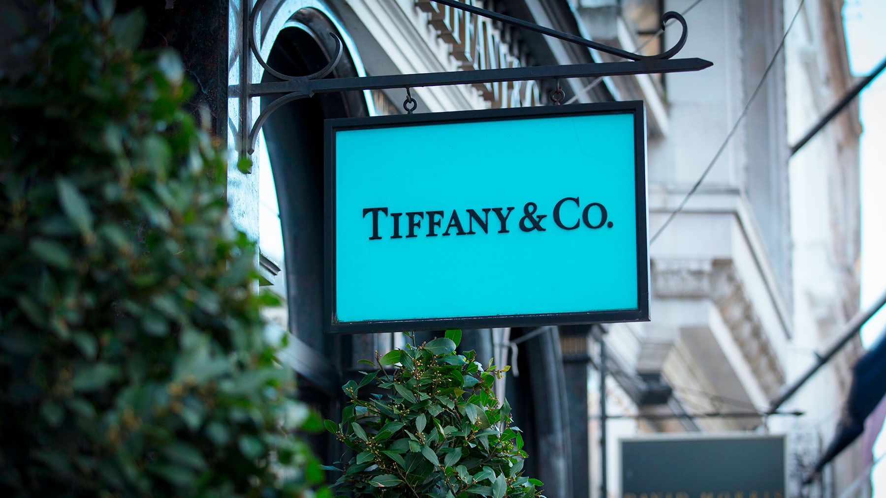
Tiffany & Co
Since being founded in 1837, Tiffany & Co has stood the test of time and are as relevant and recognisable today as the brand always has been. We’re not saying that we should all be creating marketing plans that span 200 years, but there are certainly great lessons to be learnt from Tiffany & Co.
Their branding is clever and uncomplicated. Their brand tone of voice is always elegant, classic, with a touch of wit. It’s this wit that, although they’re positioned in the luxury sector, doesn’t make the brand feel so affluent that it’s disconnected from everyday people.
Their brand logo is also simple and elegant, mostly seen on the green-blue background which is Tiffany’s leading brand colour – now so affiliated with the brand that we refer to it as ‘Tiffany blue.’ When it comes to imagery, it’s always beautiful and refined, juxtaposed against their witty tone of voice. Tiffany & Co is a great example of how you can inject a sense of fun and informality into a premium brand.
Oatly
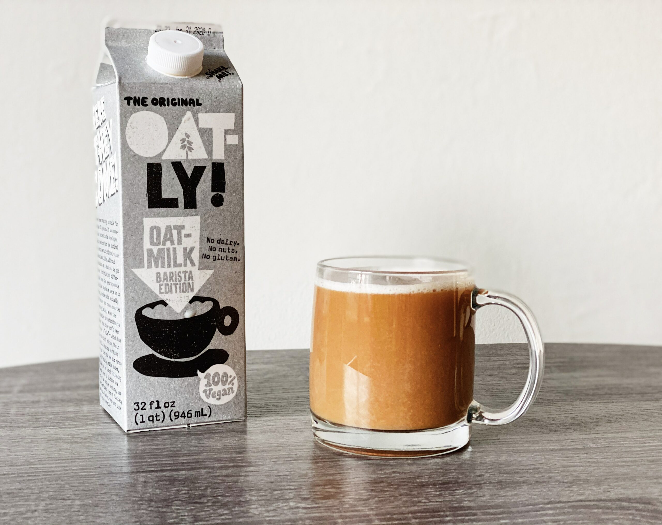
The epitome of a ‘cool’ brand, Oatly have actually been around for over twenty years, but only hit the mass market after a rebrand.
They redesigned their packaging and tone of voice to appeal to a new generation of young people, striving to adopt a healthier lifestyle. They’re also open to temporarily adjusting their branding to jump on trends and have been known to change their website homepage address and design, to maintain their position as a leading brand for young people.
For example, as part of a tongue-in-cheek campaign to help young people talk to their families about switching to a dairy alternative, Oatly changed their web address and landing page to helpdad.com. It’s a tactic that wouldn’t be possible without the time spent building a brand that is expected to think outside the box of marketing as we know it.
Through fun campaigns, cheeky slogans like ‘wow, no cow!’ and a typeface which looks hand-drawn, Oatly connects with their ideal customer on a level that no other milk-alternative brand has yet managed.
Ready to start shaping your brand?
There is, of course, so much more that goes into creating a brand identity, but we’ve hopefully got your brain whirring. Here at Growth Animals, we’re in the business of growing brilliant brands, so if you’d like some more help, pop us an email: [email protected]

